Tag: Windows Phone Developer Tools

EvenTiles from Start to Finish–Part 6

In the previous episode of this series about how to develop a Windows Phone application from scratch we used IsolatedStorage to persist some data. Since IsolatedStorage is a file store on a Windows Phone device, for exclusive use by a single application, it can be a challenge to look at its contents. Luckily, the Windows Phone 7.1 SDK has a tool available to explore IsolatedStorage contents. In this episode of EvenTiles we will explore this Isolated Storage Explorer Tool.

The Isolated Storage Explorer Tool is a command line tool, which is installed together with the Windows Phone 7.1 SDK in the following folder:

C:\Program Files (x86)\Microsoft SDKs\Windows Phone\v7.1\Tools (64 bit OS)
or
C:\Program Files\Microsoft SDKs\Windows Phone\v7.1\Tools (32 bit OS)

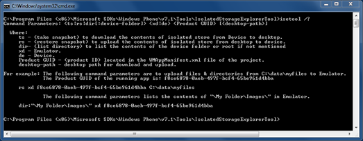
The tool itself has a lot of parameters, to get contents from IsolatedStorage, to write contents to IsolatedStorage, to specify an application and to specify a device. In a command prompt some limited help information is available:

image

In order to retrieve our ApplicationSettings from IsolatedStorage for EvenTiles, the first thing we need to know is the ProductID for our application. This ide can be found in the WMAppManifest.xml file.

WMAppManifest.xml
  1. <Deployment xmlns="http://schemas.microsoft.com/windowsphone/2009/deployment" AppPlatformVersion="7.1">
  2.   <App xmlns="" ProductID="{883385e6-52e5-4835-83db-8a17499b5767}" Title="EvenTiles"

The next thing we need to do is make sure that the Emulator is started (or a physical device is connected). Either should have the application installed, but it is not necessary to have the application running. After passing the following command,

image

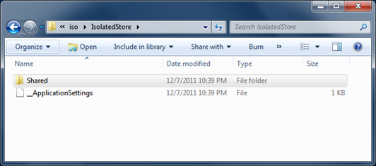
the folder C:\iso will contain a snapshot of our application’s IsolatedStorage.

image

When we drag and drop the _ApplicationSettings file to Visual Studio 2010, you can see that its contents are XML data, representing a Dictionary with one single entry defined in it, matching our Secondary Tile’s back side string.

image

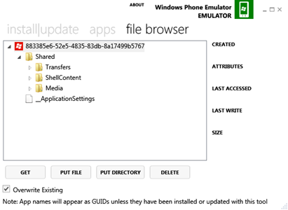
You might not like using a command line tool to explorer IsolatedStorage. In that case, there is good news for you. If you browse to http://wptools.codeplex.com/, you will find the Windows Phone Power Tools for download. This handy collection of tools embeds the different SDK tools including the Isolated Storage Explorer Tool inside a Windows application. With that application you can explore your application’s IsolatedStorage as well. Using the power tool, it is also easy to write new or modified files to your application’s IsolatedStorage. The latter makes a lot of sense if you want to test new versions of applications against old contents in IsolatedStorage, for instance to migrate old files to new versions.

image

The following video shows the Isolated Storage Explorer Tool and the Windows Phone Power Tools in action.

Using the Isolated Storage Explorer Tool and the Windows Phone Power Tools

So this time we did not add functionality to our EvenTiles application, but it is important to learn about useful tools to help us develop our applications as well. In the next episode we will talk about Tombstoning and Fast Application switching and what we need to do in our application to support these two important execution states on Windows Phone devices.

imageIf you want to see EvenTiles already in action on your Windows Phone, you can install the latest release from Marketplace. Remember that this application is not meant to be extremely useful, although it contains similar functionality that “serious” applications have. All functionality that you can find in the released version of EvenTiles will be covered in the upcoming episodes of this blog series, together with all source code. Just go ahead and get your free copy of EvenTiles from Marketplace at this location: http://www.windowsphone.com/en-US/search?q=EvenTiles (or search on your phone for EvenTiles in the Marketplace application).
EvenTiles from Start to Finish–Part 4

In the third part of this series about how to develop a Windows Phone application from scratch we looked at the Silverlight Toolkit for Windows Phone and page transitions. Today we will work on some functionality in the Settings Page of our application. We will take off where we finished in Part 3, and start with an empty SettingsPage (except for the application name and page title).

The purpose of our complete sample application is to create a Secondary Tile programmatically and pin that to the Start Screen of the user. The Secondary Tile has a front and a back. The text on the backside of the tile can be modified by the end user. EvenTiles is not meant to be extremely useful, it is there to help introduce lots of programming aspects to develop Windows Phone applications.

In this episode we will add a few UI Elements to the SettingsPage to realize the follow functionality:

  • The text that will be displayed on the backside of the Secondary Tile is visible;
  • The backside text can be modified;
  • If the backside text differs from a default text, a button is displayed to allow easy restoration of the default backside text, otherwise the button is invisible.

The SettingsPage gets the following layout:

image

The layout of the UI is relatively simple. In the ContentPanel of the PhoneApplicationPage we have a StackPanel containing 3 different items (a TextBlock, a TextBox plus a hidden Button) and a ToggleSwitch (that is defined in the Silverlight Toolkit for Windows Phone). The ToggleSwitch is already visible but does currently not have any functionality associated to it. The ContentPanel itself is a Grid. Initially, a Grid has one row and one column. To place UI Elements in the Grid and to position them at a particular location you typically make use of multiple rows and/or multiple columns that you first have to define. To get the desired layout, the Grid contains 3 separate rows. In the first row (being row number 0), the StackPanel is hosted. This row takes the height it needs to display all visible UI Elements of the StackPanel. The next row on the Grid takes up whatever space is left on the grid and the last row takes precisely the height it needs to display the ToggleSwitch. The XAML for the ContentPanel looks like this:

SettingsPage UI
  1. <!–ContentPanel – place additional content here–>
  2. <Grid x:Name="ContentPanel"
  3.         Grid.Row="1"
  4.         Margin="12,0,12,0">
  5.     <Grid.RowDefinitions>
  6.         <RowDefinition Height="Auto" />
  7.         <RowDefinition />
  8.         <RowDefinition Height="Auto" />
  9.     </Grid.RowDefinitions>
  10.     <StackPanel>
  11.         <TextBlock HorizontalAlignment="Left"
  12.                     TextWrapping="Wrap"
  13.                     Text="Set your own tile text (approx. 45 characters)"
  14.                     VerticalAlignment="Top"
  15.                     Margin="12,0" />
  16.         <TextBox x:Name="tbBackContent"
  17.                     TextWrapping="Wrap"
  18.                     MaxLength="45"
  19.                     d:LayoutOverrides="Height"
  20.                     TextChanged="tbBackContent_TextChanged" />
  21.         <Button x:Name="btnRestore"
  22.                 Content="Restore Default Text"
  23.                 Margin="0,0,0,3"
  24.                 d:LayoutOverrides="Height"
  25.                 Click="btnRestore_Click"
  26.                 Visibility="Collapsed" />
  27.     </StackPanel>
  28.     <toolkit:ToggleSwitch Header=""
  29.                             Grid.Row="2"
  30.                             Content="Allow using Location?" />
  31. </Grid>

You can see our Grid.RowDefinitions being defined. There is also a possibility to define Grid.ColumnDefinitions, but for this particular simple UI we only need rows. Scrolling through the XAML you can see all individual UI Elements being defined. The TextBox and the Button connect events to event handlers. For the Button, the Click event is connected to a method called btnRestore_Click. Each time the user Clicks the Button, the code that is defined in btnRestore_Click will execute. That code is defined in C#. We will take a look at the code later. The TextBox uses the TextChanged event, that will be fired each time the value of the Text property of the TextBox changes. If this happens, code inside the method tbBackContent_TextChanged will execute.

In Part 2 of EvenTiles we looked at the NavigationService that can be used to navigate from one PhoneApplicationPage to another PhoneApplicationPage. Each time the user navigates to a particular page, the OnNavigatedTo method on that page is called. You can override that method to extend its functionality. When the user navigates away from a PhoneApplication, a similar method (OnNavigatedFrom) is called that you again can override to add specific functionality you need on a particular page. In the SettingsPage of EvenTiles we are overriding both these methods to add some functionality:

OnNavigated …
  1. protected override void OnNavigatedTo(System.Windows.Navigation.NavigationEventArgs e)
  2. {
  3.     base.OnNavigatedTo(e);
  4.     tbBackContent.Text = App.ActualSecBackContent;
  5.     btnRestore.Visibility = tbBackContent.Text.Equals(App.DefaultSecBackContent) ? Visibility.Collapsed : Visibility.Visible;
  6. }
  7.  
  8. protected override void OnNavigatedFrom(System.Windows.Navigation.NavigationEventArgs e)
  9. {
  10.     base.OnNavigatedFrom(e);
  11.     App.ActualSecBackContent = tbBackContent.Text;
  12. }

Both these methods contain a call to a similar method, preceded by the keyword base. These methods execute functionality that is defined in the base class of our derived PhoneApplicationPage class. To make sure that we don’t skip that code (which might contain important functionality for page navigation) we have to call those methods. Immediately under the call to the base class methods, our own functionality is added. When we are navigating to the SettingsPage, we initialize the TextBox with the currently stored backside content for a Secondary Tile that we will create later in this series. This content is defined in a string property in the App.xaml.cs file. Next we determine if the Button that can be used to restore a default text needs to be visible. This is only the case when the TextBox displays something different from a default text that is also defined in App.xaml.cs. In App.xaml.cs the default text is assigned to the actual text.

When the user is leaving the SettingsPage (for instance by pressing the Back button on the phone), we simply store the current content of the TextBox for later use.

Let’s now take a look at the event handlers for both the Button and the TextBox:

Event Handlers
  1. private void tbBackContent_TextChanged(object sender, System.Windows.Controls.TextChangedEventArgs e)
  2. {
  3.     btnRestore.Visibility = tbBackContent.Text.Equals(App.DefaultSecBackContent) ? Visibility.Collapsed : Visibility.Visible;
  4. }
  5.  
  6. private void btnRestore_Click(object sender, System.Windows.RoutedEventArgs e)
  7. {
  8.     tbBackContent.Text = App.DefaultSecBackContent;
  9. }

If the text in the TextBox changes, the TextChanged event handler code will execute. Just like in the OnNavigatedTo method, we determine if the Button that can be used to restore a default text needs to be visible. If the Button is clicked, we simply restore the default text. Since this also fires a TextChanged event (after all, the text of the TextBox is changed), executing code in the TextChanged event handler will now result in the Button to be hidden.

In the following video you can see all the steps that are needed to add the described functionality to the SettingsPage.

Extending the SettingsPage for EvenTiles

We are still far away from having all functionality in place to actually make a Secondary Tile visible on the Start Screen. However, we need to understand a few fundamental concepts in order to create successful Windows Phone applications, so we will continue with the ground work for another couple of episodes. In the next episode we will look at persisting data in IsolatedStorage to make sure that we store data when the user stops using our application.

EvenTiles from Start to Finish–Part 3

In the second part of this series about how to develop a Windows Phone application from scratch we looked at the ApplicationBar and Page Navigation. Today we will introduce the Silverlight Toolkit for Windows Phone, show how to use it inside an application and add page transitions to the application. We will take off where we finished in Part 2.

The Silverlight Toolkit for Windows Phone is a separate assembly that you can install after downloading it. It installs in the same location where the Windows Phone SDK’s are installed, making it very easy to add a reference to it in order to use functionality that can be found in the toolkit.

imageAfter you have installed the toolkit, you can add a reference to it inside your application by right-clicking the references field your project and selecting the toolkit in the dialog box that appears. After adding the toolkit to the references, you will see it under references inside solution explorer. The first thing we are going to do is adding page transitions. If you look at the video, you will see that the pages of our application are currently simply appearing without any animations. However, page transitions inside many applications are similar to turning pages in a book. This is for instance the case with applications that are already installed on your Windows Phone. The Silverlight Toolkit contains functionality to make it very easy to incorporate similar page transitions inside your own applications. There are many different transitions to choose from, but we will use the same page turning transitions that you probably already know when you activate an application from the start screen.

To add page transitions inside your own application, it is important to change the PhoneApplicationFrame for your application into a TransitionFrame. The latter is defined in the Silverlight toolkit and allows for page transitions. The RootFrame is a container to hold all pages that you will create inside your application. You will have to search for the method InitializePhoneApplication inside the source file App.xaml.cs that Visual Studio created for you when you created the EvenTiles project. Inside this method, you can see that a new RootFrame is created of type PhoneApplicationFrame. You will have to change this into a TransitionFrame in order to get your page transitions working.

Using a TransitionFrame
  1. // Do not add any additional code to this method
  2. private void InitializePhoneApplication()
  3. {
  4.     if (phoneApplicationInitialized)
  5.         return;
  6.  
  7.     // Create the frame but don't set it as RootVisual yet; this allows the splash
  8.     // screen to remain active until the application is ready to render.
  9.     // RootFrame = new PhoneApplicationFrame();
  10.     RootFrame = new TransitionFrame();
  11.     RootFrame.Navigated += CompleteInitializePhoneApplication;
  12.  
  13.     // Handle navigation failures
  14.     RootFrame.NavigationFailed += RootFrame_NavigationFailed;
  15.  
  16.     // Ensure we don't initialize again
  17.     phoneApplicationInitialized = true;
  18. }

In order to get page transitions working, the next thing you have to do is add some XAML that defines the different page transitions to each page on which you want to make use of page transitions. Instead of adding individual pieces of XAML for each page, you can also create a new style that you use inside all pages that you want to make use of page transitions. That is the approach we are taking in this sample. First thing to do is add the following XAML to the App.xaml file:

PageTransition Style
  1. <!–Application Resources–>
  2. <Application.Resources>
  3.     <Style x:Key="DefaultPageWithTransitions"
  4.             TargetType="phone:PhoneApplicationPage">
  5.         <Setter Property="sltk:TransitionService.NavigationInTransition">
  6.             <Setter.Value>
  7.                 <sltk:NavigationInTransition>
  8.                     <sltk:NavigationInTransition.Backward>
  9.                         <sltk:TurnstileTransition Mode="BackwardIn" />
  10.                     </sltk:NavigationInTransition.Backward>
  11.                     <sltk:NavigationInTransition.Forward>
  12.                         <sltk:TurnstileTransition Mode="ForwardIn" />
  13.                     </sltk:NavigationInTransition.Forward>
  14.                 </sltk:NavigationInTransition>
  15.             </Setter.Value>
  16.         </Setter>
  17.         <Setter Property="sltk:TransitionService.NavigationOutTransition">
  18.             <Setter.Value>
  19.                 <sltk:NavigationOutTransition>
  20.                     <sltk:NavigationOutTransition.Backward>
  21.                         <sltk:TurnstileTransition Mode="BackwardOut" />
  22.                     </sltk:NavigationOutTransition.Backward>
  23.                     <sltk:NavigationOutTransition.Forward>
  24.                         <sltk:TurnstileTransition Mode="ForwardOut" />
  25.                     </sltk:NavigationOutTransition.Forward>
  26.                 </sltk:NavigationOutTransition>
  27.             </Setter.Value>
  28.         </Setter>
  29.     </Style>
  30. </Application.Resources>

Here we define different transitions that will run when you are navigating to and from pages inside the application. The transitions that you can see in the code snippet are all TurnStileTransitions which are commonly used for page transitions inside a Windows Phone application. The Silverlight Toolkit contains other transition types as well.

imageAfter having defined the transitions and after having changed the RootFrame to be able to host transitions, the only thing that is left to do is assigning newly created transition style to each individual page. This can for instance be done using Expression Blend. When you now would run the application, it will blend in perfectly with applications that came with your Windows Phone. Navigating from page to page inside our application is now identical to navigating inside for instance the different settings on the Windows Phone. Of course it is not necessary to make use of page transitions, but it does make your application look better and even more professional.


The Silverlight Toolkit for Windows Phone contains much more useful items, like a number of cool user interface elements. To see already one of them in action, we are adding it to the Settings Page. On the SettingsPage we later need a switch that can enable / disable reading of location data. Right now we are just going to enter a dummy switch and we are choosing a nice control from the Silverlight Toolkit, the ToggleSwitch. This control looks like a light switch and has (like a CheckBox) two different states, checked and unchecked. This control looks extremely good inside a Windows Phone application, as you can see in the following screenshot:

image

Inside Visual Studio 2010 Express Edition you can see the SettingsPage in designer mode. In it, you can also see a ToggleSwitch (in checked mode). The ToggleSwitch is added to the content grid, filling up as much space as it needs in the last row of the grid. How to layout UI controls inside a grid and in other container controls is something we will cover later in this series about Windows Phone Application Development.

In the following video you can see all the steps that are needed to add transitions to your Windows Phone Application and how to be able to use functionality from the Silverlight Toolkit inside your own application.

Using the Silverlight Toolkit to add Page Transitions to EvenTiles

LiveTiles will be extended soon. In the next episode we will create the SettingsPage UI and make sure that we can store data entered on the SettingsPage. Make sure to lookout for part four in this series about Windows Phone application development which will be published soon.

EvenTiles from Start to Finish–Part 2

In the first part of this series about how to develop a Windows Phone application from scratch we looked at the initial project and how to initialize the Application Tile by setting elements in the manifest file. Today we will add an ApplicationBar to our application and we will add page navigation as well. We simply take off where we finished in Part 1. Adding an application bar is actually easier from within Expression Blend. This tool can be used to design and prototype Windows Phone applications. The advantages of using Expression Blend to add the application bar are:

  • immediate visual feedback;
  • simple selection / insertion of application bar icons
  • simple reordering possibilities for application bar icons en menu items.

imageVisual Studio can work closely together with Expression Blend. Changes in one environment will be visible in the other environment (usually changed files must only be saved or a project must be rebuilt in order to achieve this). If a solution is already open in Visual Studio, you can start Expression Blend from within the Project Menu as shown. Even though you can use Expression Blend to add code to your Windows Phone pages, you probably want to limit doing so, since you don’t have Intellisense available, which is one of the great features of Visual Studio that really makes entering code easy. You can immediately see that you are in a different environment when looking at Expression Blend. Its default theme color is dark. Something else that is immediately noticeable is the large amount of windows, options and choices available inside Expression Blend. It surely will take you some time to feel comfortable in this powerful design tool.

image

What you can see here is Expression Blend showing the MainPage of our EvenTiles application. You can also see how to select an ApplicationBarIcon in the collection of ApplicationBarIcon buttons. Besides concentrating on creating a (static) UI for a Windows Phone application, Expression Blend is also a fantastic tool to create different visual states and animations. We are still in the early stages of application development in this series, but more in depth usage of Expression Blend will definitely follow later on. For now we will just add a little bit of functionality to our application. Using Expression Blend, two new pages have been added to the project, a Settings Page and an About Page. Both these pages only contain a filled title section. Right now, the only functionality that will be added to the application is code to navigate to each of the two empty pages when the corresponding ApplicationBar buttons are clicked. The following code snippet shows the ApplicationBar that was created with Expression Blend in XAML, and already includes Click event handlers:

ApplicationBar on MainPage
  1. <phone:PhoneApplicationPage.ApplicationBar>
  2.     <shell:ApplicationBar Opacity="0">
  3.         <shell:ApplicationBarIconButton IconUri="/icons/appbar.feature.settings.rest.png"
  4.                                         IsEnabled="True"
  5.                                         Text="settings"
  6.                                         Click="Settings_Click" />
  7.         <shell:ApplicationBarIconButton IconUri="/icons/appbar.questionmark.rest.png"
  8.                                         IsEnabled="True"
  9.                                         Text="about"
  10.                                         Click="About_Click" />
  11.     </shell:ApplicationBar>
  12. </phone:PhoneApplicationPage.ApplicationBar>

To add code to the Click event handers, we are using the C# code behind file, belonging to the MainPage.

image

To create entries in the code behind file for both Click event handlers (and in that way connecting XAML to code), you can right click on the event handler in XAML and selecting Navigate to Event Handler entry from the shown popup menu. The code in the event handlers is very simple, using the NavigationService to navigate to another page by providing a Uri that contains the page name.

Navigating to other pages
  1. private void Settings_Click(object sender, EventArgs e)
  2. {
  3.     NavigationService.Navigate(new Uri("/SettingsPage.xaml", UriKind.Relative));
  4. }
  5.  
  6. private void About_Click(object sender, EventArgs e)
  7. {
  8.     NavigationService.Navigate(new Uri("/AboutPage.xaml", UriKind.Relative));
  9. }

After deploying the application to the emulator, the Main Page shows an ApplicationBar. Clicking on either of the two ApplicationBar buttons results in navigating to another page inside the application. The following video shows all steps to create the ApplicationBar, the additional pages and the code to navigate from page to page:

Adding an ApplicationBar and showing page navigation

LiveTiles will be extended soon. In the next episode we will take a look at the Silverlight toolkit, Page Transitions and additional controls that are available in the Silverlight toolkit. Make sure to lookout for part three in this series about Windows Phone application development.

EvenTiles from Start to Finish–Part 1

As I promised a few days ago, in between other blog entries I will show you how to create a complete Windows Phone application from scratch. This project starts with running Visual Studio to create an initial solution and it stops after having updated the application a few times and successfully submitted each different version to MarketPlace. Initially I will focus on creating the application without thinking too much about testability and reusability. I just show you the possibilities of Visual Studio, the Emulator and later on Expression Blend, Marketplace and additional tools. Later in this project we shift focus towards creating a more maintainable application, also using modern design patterns like MVVM. This series of articles is not meant to be a complete programming course for Windows Phone. If you want to know more about developing applications in C#, you should take a look at the Rob MilesYellow Book. Not only an excellent resource to learn the C# programming language but also fun to read. If you want to learn more about Windows Phone application development, I can highly recommend Rob Miles’ Blue Book, and Charles Petzold’s book titled Programming Windows Phone 7. The good news is that all these books can be downloaded for free and they are all very valuable resources.

Ok, back to application development. In this first part, you will learn how to create the initial solution for your project, how to modify the default Application Tile, how to write something on the back of the Application Tile through the manifest file and how to modify the default Icon. You will also see the application in action for the first time. All steps that are necessary are not only documented, but also accompanied by a short video that can be viewed in this blog entry as well. If you already want to have a sneak preview of the application we are going to develop, it will be published on Marketplace soon. I will update this line with the link to the application once it has been certified.

To begin with, we create a new Windows Phone Silverlight Application, call it EvenTiles and modify both the ApplicationIcon.png and the Background.png files to have a transparent icon for the application and a transparent Application Tile. The cool part about adding transparency is that the area’s of the art work that are transparent show up in the theme accent color that is selected by the user of the phone. Of course we are also setting the application name and a page name on the application’s main page.

image

For this first version of EvenTiles we are not going to add additional functionality, although we will change the behavior of the Application Tile. Instead of showing a static Application Tile, we want it to alternate between displaying the front and the back. We can achieve this by providing back side content for the Application Tile. This can actually be done in code, but also by adding definitions for background content to the application’s manifest file. Each Windows Phone application has a manifest file with the name WMAppManifest.xml that contains information about the application, including an optional definition of content that needs to be displayed on the back side of the Application Tile. We will modify the WMAppManifest file to specify what we want to see on the back side of the Application Tile (as shown in the following code snippet):

Defining the Application Tile
  1. <Tokens>
  2.   <PrimaryToken TokenID="EvenTilesToken" TaskName="_default">
  3.     <TemplateType5>
  4.       <BackgroundImageURI IsRelative="true" IsResource="false">Background.png</BackgroundImageURI>
  5.       <Count>0</Count>
  6.       <Title>EvenTiles</Title>
  7.       <BackBackgroundImageUri IsRelative="true" IsResource="false">Backbackground.png</BackBackgroundImageUri>
  8.       <BackTitle>EvenTiles</BackTitle>
  9.       <BackContent>Click me to start EvenTiles</BackContent>
  10.     </TemplateType5>
  11.   </PrimaryToken>
  12. </Tokens>

In order to clearly see the content on the back side of the Application Tile, it’s image is simply an entirely transparent image, meaning it will show a solid theme color as background of the back side content.

If you deploy this application to the emulator or to a real device, you will see a rotating Application Tile after you have pinned the application to the start screen. You can watch the application being created in this video:

EvenTIles:Part 1 – Add a back side to the Application Tile

So far, the following additional EvenTiles episodes have been published:

  1. Introducing the EvenTiles application
  2. ApplicationBar and Page Navigation
  3. Using the Silverlight Toolkit for Windows Phone
  4. Creating a Settings Page
  5. Storing Application Settings in IsolatedStorage
  6. Using the Isolated Storarage Explorer Tool
  7. Fast Application Switching and Tombstoning
  8. More on Tombstoning
  9. Creating a Secondary Tile
  10. Background Agents
  11. Debugging Background Agents
  12. The lifetime of a PeriodicTask
  13. Communication with a PeriodicTask
  14. Exchanging data with a PeriodicTask
  15. Adding an About Page
  16. Accessing Marketplace from within a Windows Phone Application
  17. Implementing Trial Mode 

Where is that Mutex?

In the continuous story of Live Tiles I wanted to write about updating the Application Tile by using a PeriodicTask. This is a very nice way to update the tile without having to make use of a remote service. However, the PeriodicTask needs to get some data that is available in my application. The way to go is to store that data in a file in IsolatedStorage in the application and have the PeriodicTask retrieve the data from that same file, since it has access to IsolatedStorage.

Since the application might update data that the PeriodicTask needs and since both of them are executing independently from each other, it is a good idea to protect the data by means of a synchronization object. The documentation for Background Agents even suggests using a Mutex for this purpose.

And this is where the fun started for me. I tried to create a Mutex inside my application, and time and again I ran into an issue. The Mutex object was clearly unknown in my application, even though I did add a using directive for System.Threading.

image

It took me quite some time to figure out what was going on here, especially since the PeriodicTask that I was perfectly capable of using a Mutex. Both are Windows Phone projects, both have access to more or less the same namespaces. And yet, there was this difference in recognizing a Mutex object.

image

Taking another look at the documentation for the Mutex did not really help me, although it should have helped me, because there is a hint in the documentation that I completely missed.

image

Even though I was reading the above documentation several times, I didn’t get it. I know I had access to the System.Threading namespace and I still could not use the Mutex. So I started searching for a solution on the Internet and I was not really successful in that, although I got the indication that folks are using Mutex objects in Windows Phone Mango applications. All in all I guess I wasted at least one hour when I decided to compare references to assemblies in both the application and the PeriodicTask projects. Here I found one subtle difference.

image

The difference between the two projects is a reference to mscorlib.extensions. After adding a reference to that assembly in my application’s project, I could use the Mutex. Of course it simply comes back to reading the documentation, because it does indicate that the necessary assembly is mscorelib.extensions (in mscorlib.Extensions.dll). Ignoring that one little sentence delayed me for at least one hour. Hopefully you don’t fall in the same trap.

Windows Phone Application Development & Debugging – Deactivation versus Tombstoning

While creating an update of an existing application I ran into a problem that sometimes occurred when the application was moved to the background. It turned out that the application behaved consistent with no exceptions raised when it was tombstoned after being moved to the background. However, the application sometimes crashed when it was deactivated and immediately became the executing application again without being tombstoned. In a later post I will explain the specific problem that caused the application to crash, for now I want to focus on ways to easily test deactivation scenarios.

Visual Studio 2010 has great support to test tombstoning scenarios for Windows Phone applications. Simply start debugging an application on a device or on device emulator and click the start button on the device (emulator). You will notice that the application moves to the background but that Visual Studio does not terminate its debugging session. Putting a breakpoint inside Activated / Deactivated event handlers shows us that the application is indeed being tombstoned / resurrected.

Visual Studio and Tombstoning

The debugger shows that the application is still running even though the application is no longer visible on the device. By using the back key on the device, it is possible to return to the application and to continue debugging it. However, if you start the application again on the device (so not using the back key), the debugger terminates. This means that a brand new instance of the application was started. Inside an application, it is possible to distinguish between a new instance being started and resurrection from being tombstoned by acting on the Launching or Activated events respectively. In both cases, the constructor of the page that becomes visible will be executed. More information about the application life cycle of a Windows Phone application can be found in this excellent series of blog entries by Yochay Kiriaty.

There are situations where an application is moved to the background without being tombstoned. In those situations, the application simply remains resident in memory, with its process being kept alive. When the application is activated again, it simply continues running without the need to create a new physical instance of the application. For end users the behavior is identical to tombstoning, after all, the application becomes invisible when another application starts executing. For developers there is a difference though, because no Launching or Activated event is raised and no constructor code (for instance for the currently visible page) is executed. To be able to consistently test application deactivation requires some additional work. One of the ways to ‘force’ deactivation over tombstoning is by starting a PhotoChooserTask. In my own application I simply use the application bar to add a new ApplicationBarIconButton to display a PhotoChooserTask.

To assure that this ApplicationBarIconButton is only visible in Debug mode, a bit of conditional compilation is needed. The following code snippet shows how to create a new ApplicationBarIconButton programmatically, add it to the ApplicationBar and add an event handler to its click event.

Adding an ApplicationBar Item
  1. #if DEBUG
  2. PhotoChooserTask _pt;
  3. #endif
  4.  
  5. public MainPage()
  6. {
  7.     InitializeComponent();
  8.  
  9. #if DEBUG
  10.     _pt = new PhotoChooserTask();
  11.  
  12.     this.ApplicationBar.IsVisible = true;
  13.  
  14.     ApplicationBarIconButton pauseButton = new ApplicationBarIconButton
  15.     {
  16.         Text = "Pause App",
  17.         IconUri = new Uri("/Images/appbar.transport.pause.rest.png", UriKind.Relative),
  18.         IsEnabled = true
  19.     };
  20.  
  21.     pauseButton.Click += new EventHandler(pauseButton_Click);
  22.     this.ApplicationBar.Buttons.Add(pauseButton);
  23. #endif
  24. }

Of course, adding a button to an existing ApplicationBar only works if the application has 3 or less ApplicationBarButtonIcons in use. An alternative could for instance be adding a MouseLeftButtonDown event handler to the application’s title. When clicking the ApplicationBarButtonIcon you created specifically for debug purposes, what you now can do is display the PictureChooserTask. This results in your application being pushed to the background, without being tombstoned.

Forcing us to the background
  1. void pauseButton_Click(object sender, EventArgs e)
  2. {
  3.     _pt.Show();
  4. }

This approach makes it relatively easy to test the different scenarios for your application going to the background and returning to the foreground again. Here are the results in a little test application.

TombstoningOrNot

In the left screen you can see the application immediately after the main page became visible. In the center screen you see the result of clicking the pause button, after which a PhotoChooserTask was activated and closed again. What you can see is that there is no Application_Deactivated / Application_Activated combination. You can also see that no constructor is called after returning from the PhotoChooserTask. In other words, the application is not tombstoned while the PhotoChooserTask is active. Finally, the right screen shows how the application returns from being tombstoned. In this case constructors are called and Application_Activated is raised.

The issue I had in one of my applications had to do with counting on constructors to be called to dynamically add a few controls to my visual tree.

Note: This blog entry is applicable for Windows Phone 7. For the next version of Windows Phone (codenamed Mango), developers can choose between tombstoning and fast application switching by setting the corresponding property in the project settings. Fast application switching could be considered as another state in the application’s life cycle, being very similar to the situation that was described in this post using the PhotoChooserTask.

A new Windows Phone 7 Device (Emulator)?

Just a few hours ago, the Windows Phone Developer Tools Update was released by Microsoft. This update is specifically for Windows Phone application developers to allow them to build apps that are ready for the upcoming Windows Phone OS update. After installation of the tools update, you can test copy and paste functionality on the (also updated) emulator.

In order to start working with the updated tools, you will need to download the Windows Phone Developer Tool update and a separate Visual Studio 2010 update. Also make sure to read the Release Notes for the update. The order of installation for the separate tools is not important but you have to install them both. A little more background information about the latest WPDT update can be found on the Windows Phone Developer Blog.

It is expected that all existing apps that are already published in Marketplace will continue to work, both on phones that will be updated to the new version of the OS that will be available later, but also on phones that are not updated. To show the new copy and paste feature of Windows Phone 7 in action I have created a small application that takes a URL and allows that URL to be copied in Internet Explorer on the Windows Phone Emulator. To see this little application in action, just take a look at this video.

Windows Phone 7 Copy and Paste with the WPDT January Update.

Splash Screens

If you start developing a new Windows Phone 7 application, you usually start by creating a new Visual Studio 2010 project. As part of the initial project, Visual Studio creates a default splash screen for you, consisting of a waiting clock.

DefaultSplashScreen

A Windows Phone splash screen is simply a jpg file with a resolution of 800 * 480 pixels. This means that it is very simple to replace the default splash screen (which is conveniently stored in your Visual Studio project under the name SplashScreenImage.jpg). Just make sure you have a jpg file with the right resolution and also make sure that it is placed in the root of your Visual Studio project. The name must be SplashScreenImage.jpg and its Build Action must be set to Content in the Properties window. Leaving the original splash screen unchanged in your own application gives end users a somewhat boring experience. After all, a splash screen is used to give users the impression that your application starts fast, and it also occupies users while your application is loading. If all applications use the same default splash screen, it will not help giving users a fast starting impression about those applications. So it is important to provide your own splash screen. If an application does not spent much time initializing, the actual amount of time that a splash screen is displayed is very short. For one of my applications, I did create a reasonably nice splash screen, to find out that the splash screen often is displayed for less then a second. My initial thought was to delay application start to allow end users to admire my splash screen. Of course this is a very bad idea, something you should not even consider doing.

SplashScreen1

This splash screen is used in a little game that is available on Marketplace. Typically the game starts up in under a second, meaning the user hardly has time to see the splash screen. The good news is that it is at least not the default splash screen. I have to admit that I considered adding a delay in my application for users to see the splash screen. Of course, and end user might like it once to take a look at this splash screen, but after starting an application several times, the splash screen will become boring since it is just a static image.

On a side note, if you are curious about this game, you can find it here on the Windows Phone 7 Marketplace. Note: This link will work from a Windows Phone 7, or from a PC with Zune software installed.

Back to the story about splash screens though. If you are developing a Silverlight application for Windows Phone 7, take the following idea into consideration.  By far the best experience you can give end users for fast starting applications, is to take a screen shot from your application’s main page. If your application starts with some animation, make sure to take the screen shot from the initial situation (before the animation starts running).

SplashScreen2

Capture

Also, leave the application title / page title out of the splash screen. What I did for my latest application was taking the following shot from the main screen. Once the application is initialized, the application and page title animate in from the top, nice and gently. This gives a very nice experience for end users, and you don’t have to worry that your splash screen is only visible for a very short time, after all, your splash screen partly is your main page.


To have some nice page transitions on your main page, you can make use of functionality that is available in the November release of the Silverlight for Windows Phone Toolkit. An in-depth explanation of how to use these page transitions can be found in this MSDN  blog entry by Will Faught.

This is the code that I am using to bring in the application title and page title in an override version of the OnNavigatedTo method:

  1. protected override void OnNavigatedTo(System.Windows.Navigation.NavigationEventArgs e)
  2. {
  3.     base.OnNavigatedTo(e);
  4.  
  5.     if (Settings.Instance.ApplicationLaunching)
  6.     {
  7.         SlideTransition slideTransitionFadeIn = new SlideTransition { Mode = SlideTransitionMode.SlideDownFadeIn };
  8.         ITransition transitionTitle = slideTransitionFadeIn.GetTransition(this.TitlePanel);
  9.         transitionTitle.Completed += delegate { transitionTitle.Stop(); };
  10.         transitionTitle.Begin();
  11.         Settings.Instance.ApplicationLaunching = false;
  12.     }
  13. }

Only when my application is launching (a new instance of the application is started, or the application returns from being tombstoned), the animation will run. In all other situations ‘normal’ page transitions will be executed. I keep track of the application being launched in the app.xaml.cs source file like this:

  1. // Code to execute when the application is launching (eg, from Start)
  2. // This code will not execute when the application is reactivated
  3. private void Application_Launching(object sender, LaunchingEventArgs e)
  4. {
  5.     Settings.Instance.IsTrialMode = RunningMode.CheckIsTrial();
  6.     Settings.Instance.ApplicationLaunching = true;
  7. }
  8.  
  9. // Code to execute when the application is activated (brought to foreground)
  10. // This code will not execute when the application is first launched
  11. private void Application_Activated(object sender, ActivatedEventArgs e)
  12. {
  13.     Settings.Instance.IsTrialMode = RunningMode.CheckIsTrial();
  14.     Settings.Instance.ApplicationLaunching = true;
  15. }

As you can see, a little bit of code and an additional screen capture from of your application gives you a simple splash screen that is effective for fast loading applications, yet giving the end users a very nice starting experience of your application.

Modifying existing Silverlight Controls

During development of a brand new Windows Phone 7 application, I ran into a dilemma. The application is a game in which the user needs to memorize a number of fields. After the playing board has been displayed for a limited amount of time, the user needs to find particular fields by clicking on them. The playing board looks like this:

Screen1 

The different squares that are part of the playing board follow the theme color that the user currently has selected on the phone. Since the user needs to be able to click on the different squares, it is necessary to deal with some form of hit testing. In my initial approach I decided to build the different squares as Silverlight Rectangles, all hosted in an individual row / column inside a Grid control. Each time the user hits one of those squares, something has to happen to its appearance. In my first attempt (when creating a quick and dirty prototype), I decided to subscribe to the MouseLeftButtonDown and MouseLeftButtonUp events since Rectangles do not implement Click events. By handling both button down and button up events and capturing the mouse in between a button down and a button up event sequence, I made sure to have both events acting on the same Rectangle. Even though this approach is feasible, it takes a lot of code, just to make sure that a proper click is recognized on a Rectangle. Since this game needs to react very fast on user input, I want to execute as little code as possible to recognize which Rectangle is currently selected by the user. Also, I want to write as little code as possible, and the whole mouse capturing in combination with some different actions that need to be done on the user ‘clicking’ a Rectangle got me into writing more and more code. Until of course I realized that it was time to do some thinking and to make use of the power of Silverlight, extending existing controls and ‘good old object oriented programming’. What if I could make use of a Button control? Silverlight Buttons do expose Click events, the Button takes care of low level MouseLeftButton handling and contain lots of other functionality. In fact, Buttons contain too much functionality for the different items of my playing board. If you take a look at the Button documentation, you can see the different button styles and all different visual states, including animations that are used to move from one visual state to another. For my particular need, this is way too much functionality. So what if I can limit the functionality of a button (to only display a colored square and to expose a Click event)?

PlayButton – A very simple derived and restyled Silverlight Button

I started by creating a new Windows Phone Class Library to an existing solution in Visual Studio 2010. This Class Library contains my PlayButton class, that simply derives from Button. Replacing the original Rectangle controls on my playing board by PlayButton controls gave the following result:

Screen2


Surely, the Rectangles are replaced by PlayButtons. Because PlayButton derives from Button without modifying anything, a PlayButton is simply a Button. This is the reason why a border is shown and why the theme color of the original Rectangles is lost. It also means that there are placeholders for Content and it is possible to act on Click events. However, each time a button is clicked it is going through a number of state transitions, potentially slowing down users that want to play this particular game. To overcome these issues, I created a brand new control template, including a default style to define and render my PlayButton. In order to work properly, the default style needs to be defined in a file called ‘generic.xaml’ that should be stored in a Folder called “Themes” inside the project that hosts the user control. In this particular case, my Visual Studio 2010 solution looks like this:

SolutionExplorer


Instead of creating a new user control, including a control template and a default style, I could also have taken an alternative approach, using Expression Blend to create and modify a copy of the existing Button Control style and store the new style as resource in my Windows Phone application or in the Windows Phone application page where the style will be used. This approach is a little bit easier. I did chose to create a new default style for this particular application because I might want to re-use the PlayButton for a few other applications as well. The style I am using for the PlayButton defines a BorderControl that takes the Background and the Opacity that are defined for Button controls. The Background defaults to a PhoneAccentBrush, allowing the PlayButton to be theme aware. Here is the complete XAML for the PlayButton (definied in generic.xaml):

  1. <ResourceDictionary xmlns="http://schemas.microsoft.com/client/2007&quot;
  2.                     xmlns:x="http://schemas.microsoft.com/winfx/2006/xaml&quot;
  3.                     xmlns:phone="clr-namespace:Microsoft.Phone.Controls;assembly=Microsoft.Phone"
  4.                     xmlns:src="clr-namespace:ClickerControls"
  5.                     xmlns:vsm="clr-namespace:System.Windows;assembly=System.Windows">
  6.     <Style TargetType="src:PlayButton">
  7.         <Setter Property="Width"
  8.                 Value="100" />
  9.         <Setter Property="Height"
  10.                 Value="100" />
  11.         <Setter Property="Margin"
  12.                 Value="2" />
  13.         <Setter Property="Background"
  14.                 Value="{StaticResource PhoneAccentBrush}" />
  15.         <Setter Property="Opacity"
  16.                 Value="0.5" />
  17.         <Setter Property="Template">
  18.             <Setter.Value>
  19.                 <ControlTemplate TargetType="src:PlayButton">
  20.                     <Border x:Name="RootElement"
  21.                             Background="{TemplateBinding Background}"
  22.                             Opacity="{TemplateBinding Opacity}">
  23.                     </Border>
  24.                 </ControlTemplate>
  25.             </Setter.Value>
  26.         </Setter>
  27.     </Style>
  28. </ResourceDictionary>

As you can see in the XAML, both the style and the control template specify the control for which they are intended (being src:PlayButton). All that is left to do is setting the DefaultStyleKey to refer to the default style for the control.

  1. public class PlayButton : Button
  2. {
  3.     public PlayButton()
  4.     {
  5.         DefaultStyleKey = typeof(PlayButton);
  6.     }
  7. }

This is all there is to do to create a PlayButton which inherits Click events from a Button Control. The PlayButtons look identical to the original Rectangles, but they are simpler to use inside this particular application.

Screen1


Hopefully, this blog entry helps you making a decision on re-using existing Silverlight controls. You can give existing controls a completely new look and feel by applying new styles. Often you might be thinking about adding functionality to existing controls or adding behavior to existing controls. However, it is also completely valid to limit existing behavior on controls, just like this example shows. The PlayButton acts on Click events, but the PlayButton itself will not give visual feedback when it is clicked or when the PlayButton is disabled. So it is really up to you to get all the functionality you want. In my opinion, Silverlight is extremely powerful in allowing you to alter the appearance of existing controls or create new controls based on existing controls. I get more excited by the day that this Silverlight based programming model is one of the two different technologies that you can use to develop applications for Windows Phone 7.